/Store design and redesign
When your Shopify store needs a redesign: 7 signals
August 6, 2026 · WOCX
Most people ask whether their Shopify store needs a redesign at the wrong moment, which is either the day a competitor launches something shinier, or never. Both are expensive. Rebuilding a store that only needed a few fixes wastes money and momentum. Patching a store that has genuinely outgrown its build wastes more, slowly, because the patches stop holding and you pay again.
The useful question is not “does this look dated” but “is the problem the paint or the structure”. This piece gives you seven signals to answer that, and unlike most versions of this list, several of them are things you can measure on your own store in about ten minutes rather than feelings you have to guess at. The measurable ones come with real thresholds, because we fetched 19 live Shopify storefronts and wrote down the numbers, so “heavy” and “slow” mean something specific rather than whatever the last article you read implied.
Take the signals as a scorecard, not a checklist where any single hit is a verdict. One signal is usually a fix. Four or five together is a store whose foundation is fighting you, and that is what a redesign is actually for.
Four of the seven you can check yourself right now, without a developer and without a tool, in about the time it takes to make coffee. Here they are with the number that matters for each, so you can score the measurable half before reading the rest.
| Check | How | The line to worry about |
|---|---|---|
| Homepage weight | View source, count characters, divide by 1,024 | Over ~980KB (top quarter of real stores) |
| Script load | Search source for <script |
Well over ~98 (top quarter was 98–126) |
| Missing alt text | Compare <img count to alt= count |
Any gap between the two |
| Mobile reality | Open it on your actual phone | Add to Cart is a hunt, or layout jumps |
Signal 1: your conversion rate stopped responding to changes
The clearest sign is behavioural, and you already have the data for it. When you change something that should move conversion, whether that is a clearer offer or better photos or a faster checkout, does the number actually move? On a healthy build, sensible changes produce visible results. On a store that has outgrown its foundation, you make good changes and the needle sits still, because the thing holding conversion back is structural and lives underneath whatever you edited.
If you have made three or four genuine improvements over a few months and the conversion rate has not reacted to any of them, that is not bad luck. It usually means the ceiling is set by something you cannot reach from the theme editor, and reaching it is a redesign, not another tweak. The way to test this before spending anything is to look back at your own change history honestly. Pull up the last handful of real improvements you made, the ones you expected to matter, and check each against the conversion rate in the weeks after. If good changes reliably produced movement, your foundation is fine and the answer to a slump is another good change. If the line has gone flat regardless of what you feed it, the problem is underneath the layer you have been editing, and no further edit at that layer will reach it.
Signal 2: your homepage weighs more than it should, and you can check
Here is the first measurable one. A store accumulates weight the way a hard drive fills up, quietly, through years of apps, sections and half-removed campaigns, until the page a visitor waits for is far heavier than it needs to be. Weight is not the whole story of speed, but it is a strong proxy and it is easy to check yourself.
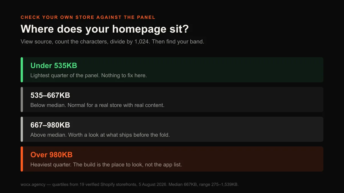
Open your homepage, right-click, and choose View Page Source. Select everything, paste it into any character counter, and divide by 1,024. That gives you the size of the HTML in KB. If you want the fuller picture that a real visitor experiences, Google’s free PageSpeed Insights will measure your live store and report what actually loads and how long it takes. But the raw HTML size is the fastest first read, so compare yours against what real stores actually ship.
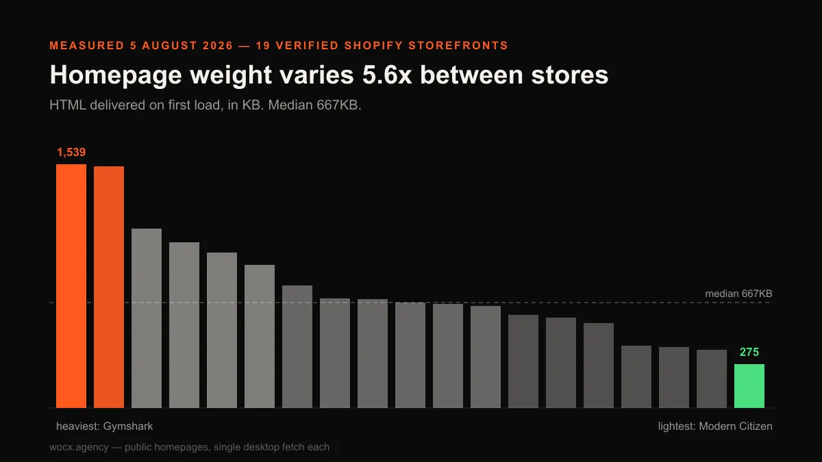
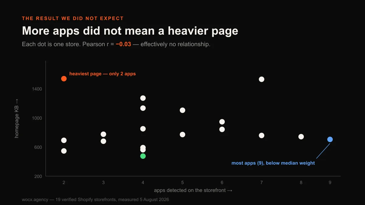
Across the 19 stores we measured, the median homepage shipped 667KB of HTML, the lightest quarter came in under 535KB, and the heaviest quarter ran over 980KB, with the worst reaching 1,539KB. If your number lands in that top band, above roughly 980KB, that is worth taking seriously. It does not automatically mean a redesign, but paired with a store that feels slow, it usually means the build is carrying weight that cannot be dieted away section by section.
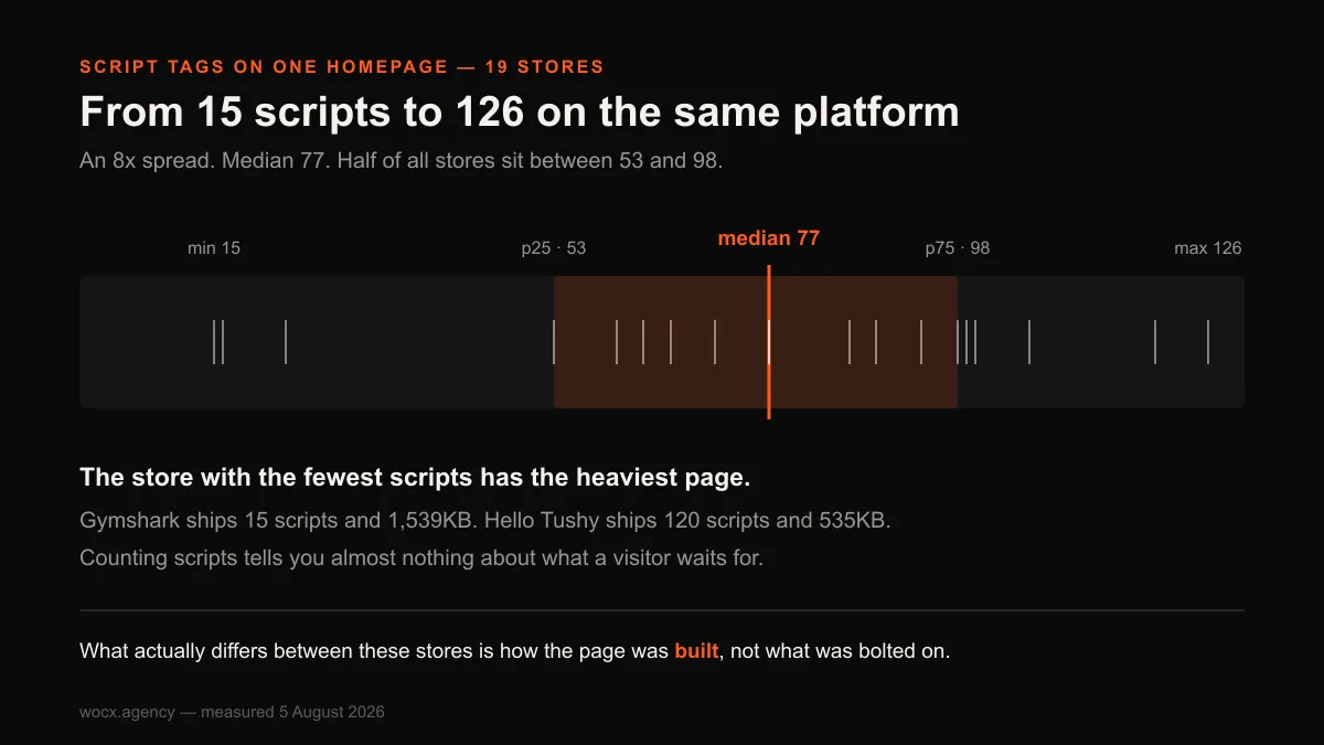
One number that is not a reliable signal, despite how often it gets quoted, is your script count. You can check it by searching the source for <script, and across our panel the totals ranged wildly, from 15 to 126 on a single homepage. But the count did not track weight at all: the store with the fewest scripts shipped the heaviest page, and the store with the most shipped one of the lighter ones. So a high script count is worth a glance but not a verdict. It tells you the store is busy, not that it is broken.
Signal 3: the fixes have started breaking each other
Every store collects small changes. A section here, an app there, a snippet a freelancer added in 2023 that nobody remembers. For a while this is fine. The signal to watch for is when fixing one thing breaks another, when a change to the product page quietly shifts the cart, or an app update takes a section down with it.
That pattern has a specific cause worth understanding, because it is the difference between a store that is merely busy and one that is genuinely fragile. It means the store’s parts are no longer independent, that they have grown tangled enough that touching one pulls on others in ways nobody can fully predict. A store like that gets more expensive to maintain every month, because every change now carries the hidden cost of a second change you did not intend and did not budget for. The clearest external symptom is your developer’s quotes creeping up for jobs that used to be small, because they have learned to price in the time to check what else might move when they touch anything. That caution is not padding their invoice. It is them charging honestly for the risk your foundation has started to carry, and it is one of the more reliable signals precisely because it shows up in someone else’s behaviour before you feel it yourself.
Signal 4: it looks wrong on a phone, where most of your buyers are
Most Shopify traffic is now on phones, often 70% or more, which means the version of your store that matters most is the one you look at least, because you build and admin on a desktop and only glance at the phone version to confirm it exists. That gap is where trouble hides. Open your own store on your actual phone, not the desktop preview and not a simulator, and walk through it exactly as a buyer would, from landing to add-to-cart. Can you reach the Add to Cart button without hunting for it? Do images load in place, or does the layout jump and shove as you scroll? Does the menu open and close cleanly with a thumb, or was it plainly designed for a mouse? Each of those is a small failure on its own, and together they are the majority of your visitors meeting friction you never see.
A store built desktop-first and squeezed onto mobile afterwards shows it here, and no amount of tweaking a desktop theme fully fixes a mobile experience that was an afterthought in the original build. If your store is clearly a desktop design apologising to a phone, that is a foundation problem, and it is the one costing you the most, because it is failing the majority of your visitors.
Signal 5: you are paying for apps to do what the store should do natively
Open your Shopify admin, look at your installed app list, and add up the monthly total sitting next to it, because that number is usually larger than owners expect and it recurs forever. Now ask a harder question than the usual “which of these can I cancel”. Ask which of these apps exist to do a job the store itself should be doing natively. There is a real difference between an app that adds a capability the platform genuinely lacks, which is money well spent, and an app you reached for only because your build could not produce something as ordinary as a custom section on its own. The second kind is rent you pay every month to cover a gap in the foundation, and the longer the list of that kind grows, the more it is telling you the store stopped being able to flex a while ago.
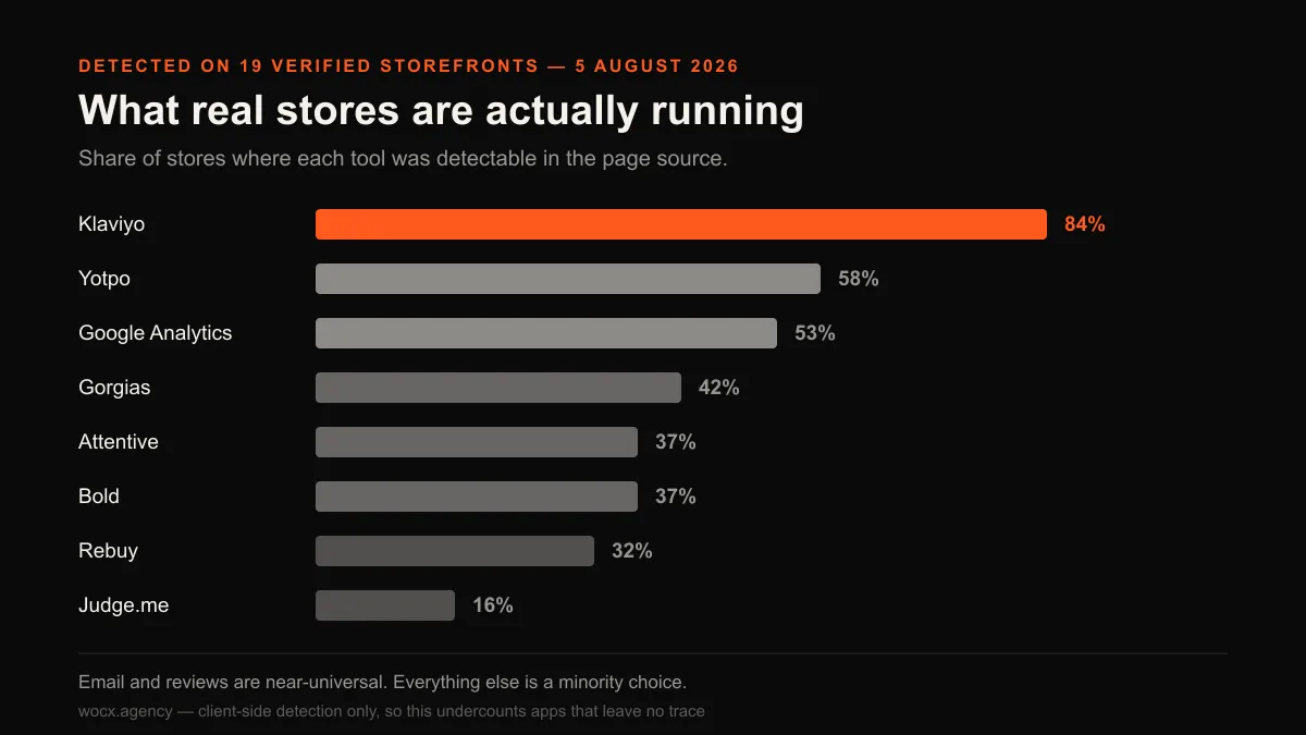
Some apps earn their place. Email and reviews are near-universal for good reason, and across our panel Klaviyo showed up on 84% of stores. But a store that has reached for an app every time it needed something custom ends up renting a dozen solutions that a proper build would own outright. The tell is not the app count itself. It is when several apps exist to paper over things the theme could not do, because that is a foundation that stopped being able to flex, and a redesign that builds those things natively usually pays for itself against the subscriptions it retires.
One thing this does not mean: apps are not what is making your store slow. We checked, and across 19 stores the number of apps had almost no relationship to page weight, a correlation of essentially zero, and the heaviest store in the sample was running only two apps, among the fewest of anyone we measured. So do not redesign to shed apps for speed. Redesign to stop paying rent on capabilities you should own. The full measurement, and why the “apps are slowing you down” line does not survive contact with real data, is in our study of 19 Shopify storefronts.
Signal 6: images that describe themselves as nothing
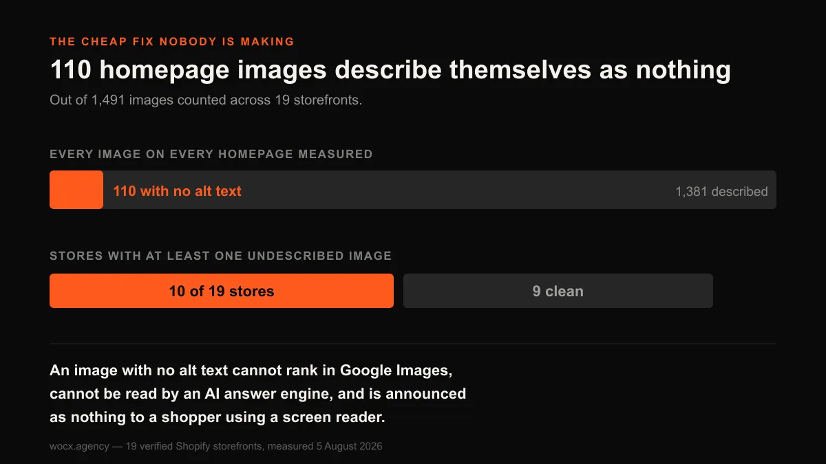
This one is nearly free to check and surprisingly common. Every image on your store should have alt text, a short description of what it shows. It is what lets the image appear in Google Images, lets an AI answer engine understand your page, and lets a shopper using a screen reader know what they are looking at.
In our panel, more than half the stores, 10 of 19, had at least one homepage image with no alt text at all. On a store where product photography is doing most of the selling, that is unforced invisibility. On its own it is a fix, not a redesign, and you should just fix it. But it is a useful tell, because a store neglecting something this basic is usually a store that has drifted from anyone paying attention to how it is built, which tends to travel with the deeper signals above.
Signal 7: you are embarrassed to send people to it
The least technical signal is often the most honest. When you win a good customer or a press mention or a partnership, are you proud to send them to your store, or do you find yourself explaining it first? “It’s a bit dated, we’re working on it” is a sentence store owners say out loud more than they admit, and it is a real signal, because you know your store better than any visitor and your instinct is picking up on things a checklist misses.
This one is not measurable, and it should not be the only reason to redesign, because pride is cheaper to satisfy than conversion. But when it lands alongside the measurable signals, when the store feels dated and weighs too much and fights you on mobile, the feeling is confirming what the numbers already showed.
Adding it up: fix or rebuild
Here is how to read your score honestly.
| Signals you hit | What it usually means |
|---|---|
| 1–2 | Fixes, not a redesign. Address them individually and move on. |
| 3–4 | A serious conversation. The foundation is showing strain; get it assessed before spending more on patches. |
| 5–7 | The build is the bottleneck. Further tweaks will underperform, and a redesign is the cheaper path over any real horizon. |
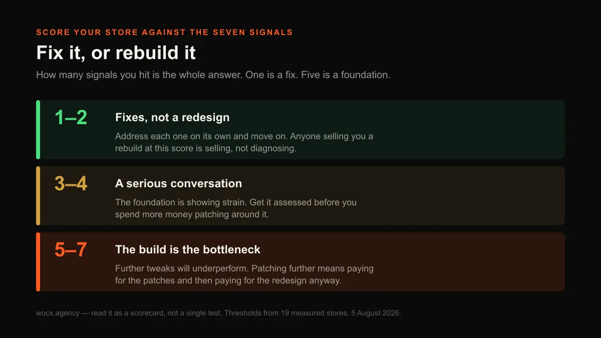
The reason this matters as a scorecard rather than a single test is that redesigns are sold too hard and bought too impulsively. A store that hits one signal does not need a rebuild, and anyone telling you it does is selling. A store that hits five is not going to fix its way out, and patching it further is the genuinely expensive choice, because you pay for the patches and then pay for the redesign anyway.
What a redesign is actually fixing
When the signals point to a rebuild, it helps to know what you are actually buying, because the word “redesign” sounds like new colours and a fresh logo and is mostly neither. The visible layer, the look a visitor notices in the first second, is the smallest and cheapest part of the work. What a redesign genuinely resets is the foundation underneath it. A homepage that ships only what the visitor needs on first load rather than everything the store has ever held. Sections built to be independent, so that fixing one cannot break another. A mobile experience designed as the primary one rather than a desktop layout apologising to a phone. And capabilities built natively into the store, replacing the apps you had been renting to cover gaps the original build could not fill. That is where the money goes, and it is invisible in a screenshot.
Those are the things that set the conversion ceiling in Signal 1, the weight in Signal 2, the fragility in Signal 3 and the mobile failure in Signal 4. They are also the things you cannot reach from the theme editor, which is exactly why a store that has genuinely outgrown its build stops responding to edits. A redesign is not a fresh coat of paint. It is replacing the structure the paint was flaking off.
FAQ
Redesign or just a fix, how do I tell?
Score it against measurable signals rather than gut feeling. If your conversion rate has stopped responding to good changes, your homepage HTML is over about 980KB, fixes break other things, and it fails on mobile, several foundational problems are stacking. One or two signals is a fix. Five or more is a store whose build is the bottleneck.
How do I check my page weight myself?
Open your homepage, right-click, choose View Page Source, select all, and paste it into a character counter. Divide the total by 1,024 for the size in KB. Across 19 real stores we measured, the median was 667KB and the heaviest quarter ran over 980KB, so use 980KB as a rough line for “worth investigating”.
Do apps slow my Shopify store down?
Barely. We measured 19 stores and found almost no relationship between the number of apps and homepage weight, and the heaviest store in the sample ran the fewest apps. Speed comes from how the store is built, not how many apps it has. Redesign to stop paying for capabilities you should own natively, not to chase speed.
How much of my Shopify traffic is on mobile?
For most stores it is 70% or more, which is why the mobile experience is the one that matters most despite being the one owners check least. Open your actual phone, not the desktop preview, and go through your store as a buyer would. If reaching Add to Cart is a hunt, that is a foundation problem a desktop-first theme cannot fully fix.
Is a Shopify redesign worth the cost?
It depends entirely on how many signals you hit. For a store with one or two, no, fix those directly. For a store hitting five or more, a redesign is usually the cheaper option over any real time horizon, because continuing to patch a foundation that has stopped holding means paying for the patches and then paying for the rebuild anyway.
Want an honest read on which side of that line your store sits? Send me the URL and I will score it against these signals with the real numbers, no obligation, usually a reply within the hour.