/Store design and redesign
The best Shopify stores, measured: the conversion playbook they actually use
August 10, 2026 · WOCX
Search for the best Shopify stores and you get the same article twenty times: a grid of handsome screenshots, a line of praise under each, and a closing note telling you to draw inspiration. A screenshot shows you a colour palette. It does not show you the thing that actually matters, which is how the store tries to turn a stranger into a buyer. What does it offer you the moment you land? How does it prove it is trustworthy? Does it push you with urgency, or does it not bother? What does it promise to lower the risk of buying?
So we measured that instead. We took 19 well-known Shopify brands and read the conversion choices off each homepage: the entry offer, the social proof, the urgency, the risk reversal, the shipping promise. Not opinions about what a good store should do. A count of what the stores people admire actually do to convert you.
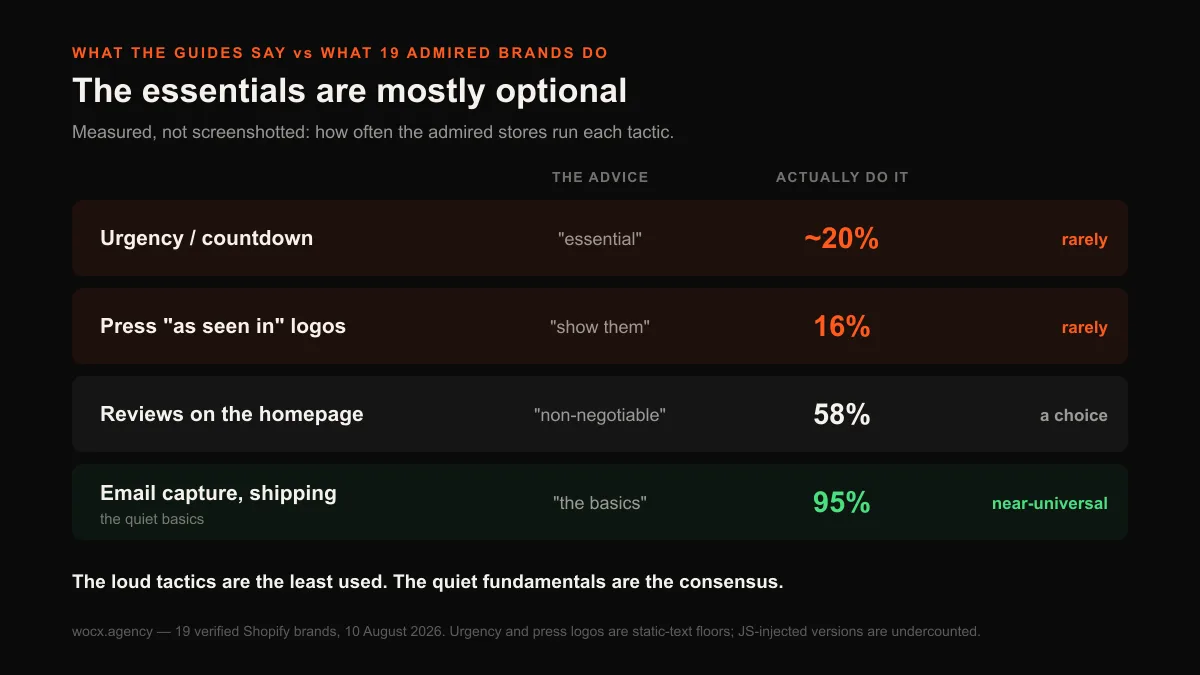
Their playbook turns out to be calmer and more disciplined than the one every conversion guide sells. The tactics you are told are essential are mostly optional, and the choices that look like details are really about positioning.
What we measured, and where it is blind
The honesty matters here, so two quick notes. First, we are not ranking these brands by revenue, because those numbers are private and any ranking claiming otherwise is guessing. These are 19 widely recognised, verified-Shopify DTC brands, names like Gymshark, Allbirds, Glossier, Fashion Nova and Kylie Cosmetics among them. “Best” means admired and established, not a leaderboard.
Second, we read the conversion copy from each homepage’s code, three fetches with the middle one measured. That sees the offers and claims written into the page, and it is blind to one thing: elements a store draws in with JavaScript after load, which includes many popups and most star-rating widgets. So every count below is a floor, not a ceiling, and we flag it whenever that changes how you should read a figure.
The offer: your discount is your positioning
The first thing a store decides is what to put in front of you on arrival, and the most common answer is a discount. A visible discount offer appeared on 12 of 19 homepages, 63%. That is the tactic every list recommends, and it is genuinely common. What the lists miss is that the size of the discount is not a detail. It is a positioning statement, and the brands use it to say completely different things. One honest limit: we read the most prominent discount on the homepage, which for a few brands may be a running sale rather than a strict email-gate offer, so read the exact figure per brand as indicative rather than precise.
The discounts we found ranged from 10% to 70%, with a median of 17.5% and 15% the single most common figure. Read the extremes and you can hear the brand talking. Gymshark opens at 10%. Mejuri, selling fine jewellery, sits at 15%. These are brands protecting a premium position, offering just enough to catch an email without training the buyer to wait for a sale. At the other end, Fashion Nova leads with 50% and Spiritual Gangster with 70%, which is a different business entirely, one built on the discount as the reason to buy now.
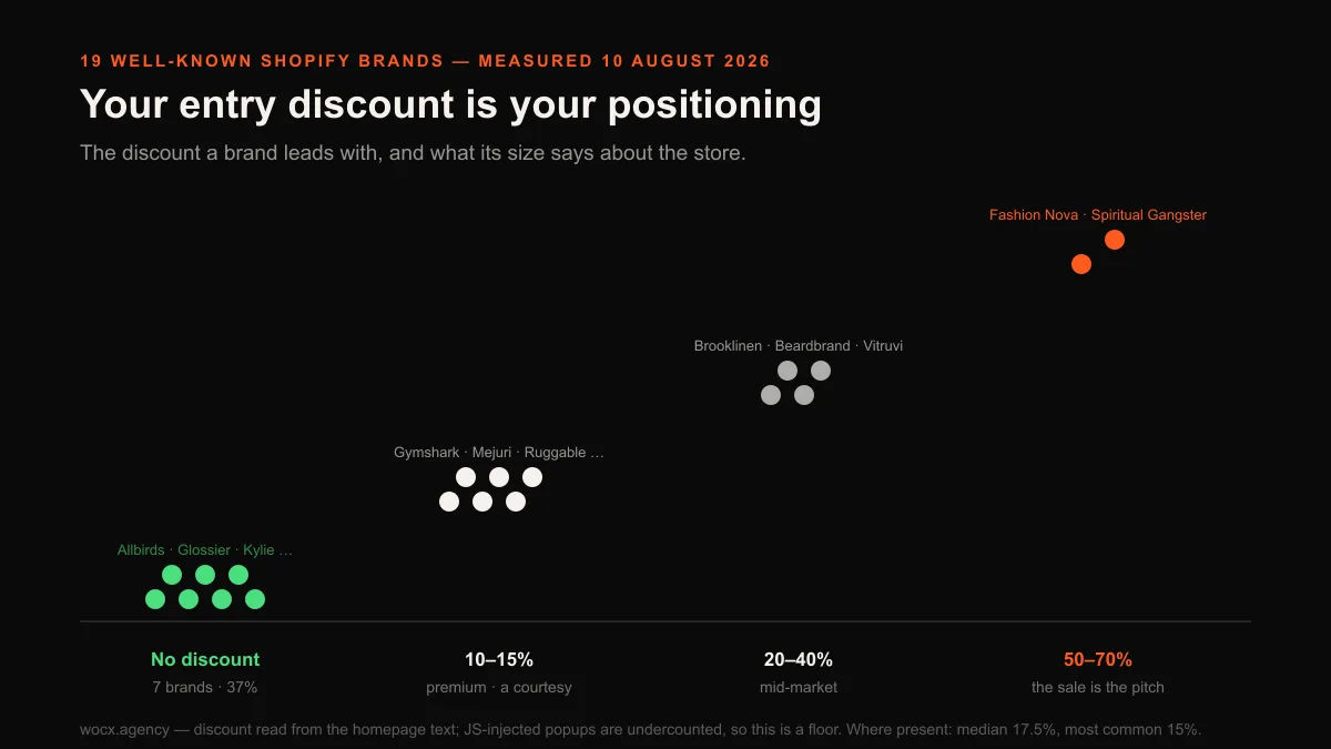
The more interesting group is the one that offers nothing. Seven of the 19, 37%, showed no discount at all, and the names matter: Allbirds, Glossier, Kylie Cosmetics, Thursday Boots. These are not small or timid brands. They have decided that leading with money off would cheapen what they sell, and that the product and the brand should carry the first impression instead. If you have been told that a discount popup is mandatory, more than a third of the most admired brands in this set disagree, and they are not the weak ones.
The CRO lesson is not “add a discount” or “do not.” It is that the discount you lead with tells the visitor what kind of store you are before they read a word. Pick it to match the position you want, not to copy a competitor whose economics you cannot see.
The clustering maps almost perfectly onto price positioning, as the table below shows. None of the bands is wrong. Each is coherent with the rest of the business, which is exactly the point: the number is downstream of the strategy, not a lever you copy from a store whose margins you have never seen.
| Entry discount | Brands in this study | What the number signals |
|---|---|---|
| None | Allbirds, Glossier, Kylie, Thursday Boots, Chubbies, Naked & Famous, Hello Tushy | The product and brand carry the first impression |
| 10–15% | Gymshark, Mejuri, Ruggable, Death Wish Coffee, Modern Citizen, Olipop | Premium; a courtesy for the email, not a reason to buy |
| 20–40% | Brooklinen, Taylor Stitch, Beardbrand, Vitruvi | Mid-market; enough to move a first-time buyer |
| 50–70% | Fashion Nova, Spiritual Gangster | Discount-led; the sale is the pitch |
Social proof: real, but quieter than you think
Every guide calls social proof non-negotiable, so you would expect it plastered across every one of these homepages. It is not. A review presence on the homepage appeared on 11 of 19, 58%, and a real review app on 10 of the 15 product pages we could also measure. Common, clearly, but not the universal law it is sold as. Several well-known brands, Gymshark and Fashion Nova among them, showed no homepage review widget in the code we could read, and let the product pages carry the proof instead. A static read can miss a widget that loads later, so treat those two as possible misses rather than certainties. But the pattern is real, and the reasoning behind it is sound: a shopper deciding on a specific item wants proof about that item rather than a generic wall of testimonials on the way in. That is not an absence of social proof. It is a decision about where proof does the most work, which is exactly the kind of judgement the “reviews on every page” rule flattens into a checkbox.
Here is where the measurement’s blind spot matters most, and honestly. Star-rating widgets are almost always injected by JavaScript, so our static read cannot see them, and the true share of stores showing ratings is higher than any number we can print. What we can see is the proof a brand hard-codes into the page as plain text, and that is where the interesting choices live. Brooklinen writes “100,000 customers” and a five-star rating directly into its homepage. Thursday Boots hard-codes “37,271 reviews.” These brands are not trusting a widget to render their most persuasive number. They have decided the count is important enough to be part of the page itself, so it appears even before the review app loads.
That is the real social-proof lesson from the admired stores. It is not “install a review app,” which everyone does. It is to decide which single proof number is your strongest, a customer count or a review total, and make sure it is not hidden inside a script that might load slowly or not at all.
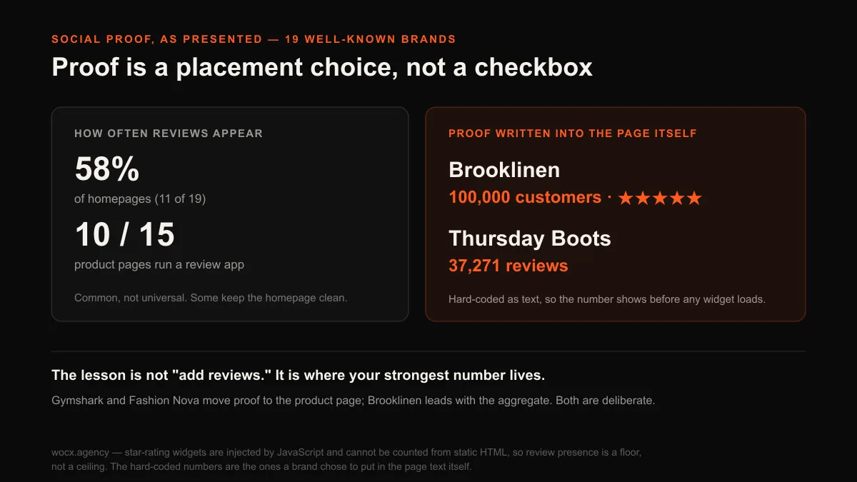
There is a second choice hidden in the numbers, which is where the proof lives. Gymshark and Fashion Nova keep it off the homepage entirely and let the product page do the persuading, on the reasoning that a shopper deciding on a specific item wants proof about that item, not a generic wall of testimonials on the way in. Brooklinen does the opposite and leads with the aggregate count, because when the whole catalogue is bedding the trust question is about the company, not the individual pillowcase. Neither is the “reviews everywhere” rule the guides repeat. Both are a deliberate answer to the question of what a buyer of this particular thing needs to see, and at what moment.
Urgency: the tactic the best stores mostly skip
If you have read anything about ecommerce conversion, you have been told urgency is essential: countdown timers, low-stock warnings, “12 people are viewing this right now.” It is the loudest and most confident advice in the category, and among the brands people actually admire it is close to absent. Text-based urgency appeared on only 3 of the 15 product pages we measured, about 20%. The honest caveat cuts the same way it does everywhere in this study, because countdown timers are usually app widgets a static read cannot see, so the true figure is somewhat higher than a fifth. But the direction does not move: the great majority of these established brands do not write scarcity into their pages, even though doing so is free and needs no app at all. A tactic that costs nothing to add, and that four in five admired brands still decline, is not the essential everyone claims. It is a choice most of them have looked at and rejected.
That rejection is deliberate, not an oversight, and the chart below puts it next to the tactics these brands do run.
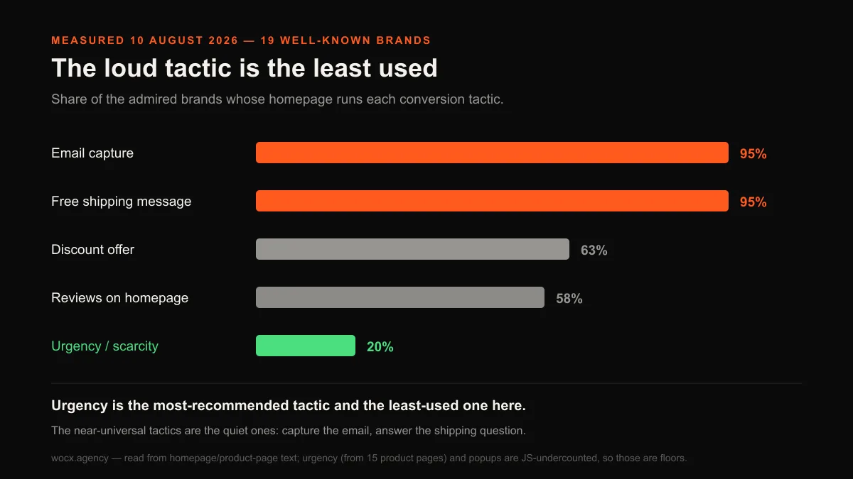
There is a reason a mature brand avoids fake urgency, and it is about trust. A countdown that resets when you reload the page reads as a trick, and a brand that wants to be bought from for years does not want to look like it is trying to close you in the next ninety seconds. For a one-time impulse product the maths is different. For a brand, the cost to credibility is one most are not willing to pay, which is why the tactic sold as essential is the one the admired stores most often leave out.
Risk reversal and shipping: the objection they answer first
The single most common reason a cart is abandoned is shipping cost, and these brands answer it before it is asked. A free shipping message appeared on 18 of 19 homepages, 95%, one of only two near-universal tactics in the whole study. It is worth being precise about what that means: this is the message placed where a shopper sees it, not a claim that shipping is actually free on every order for every brand. What the near-universal adoption tells you is that these brands treat the shipping objection as the first one worth defusing, ahead of almost everything else a homepage could say. They would rather spend prime space reassuring you that the number at checkout will not jump than use it for another product shot or a second call to action, because the abandoned-cart data has taught the whole category that unexpected shipping cost is what loses the sale.
The more useful finding is how the good stores frame it. Free shipping over a threshold is not a giveaway, it is an average-order-value lever, and the thresholds we could read clustered in a tight band: Vitruvi at $80, Spiritual Gangster and Hello Tushy at $99, Brooklinen at $100. That $80 to $100 range is not a coincidence. It is set a comfortable step above the typical order so that the free-shipping offer nudges the basket up rather than simply giving margin away. If your threshold is set at or just below your current average order, you are paying for shipping without getting the lift.
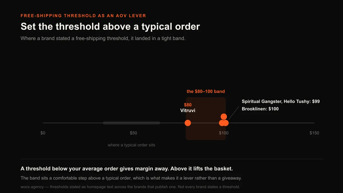
Explicit guarantees and returns promises in the homepage text were less common, on 5 of 19, 26%, though this is a floor since returns policies often sit in the footer or load later. The pattern across the risk-reversal choices is consistent: the objection these brands answer loudest and earliest is shipping cost, because it is the one that kills the most carts.
| Conversion tactic | Brands using it | The usual advice | What the data says |
|---|---|---|---|
| Email capture | 18 of 19 (95%) | “Build your list” | Genuinely near-universal |
| Free shipping message | 18 of 19 (95%) | “Answer shipping early” | Genuinely near-universal |
| Discount offer | 12 of 19 (63%) | “Always have one” | Common, but a positioning choice |
| Reviews on homepage | 11 of 19 (58%) | “Non-negotiable” | A choice; product pages may carry it |
| Risk reversal in text | 5 of 19 (26%) | “Reassure the buyer” | Less common, and a floor |
| Urgency / scarcity | ~3 of 15 (20%) | “Essential” | Most brands skip it |
The one tactic almost all of them run
Strip away the tactics that split the field and one acquisition move survives on nearly every store. Email capture appeared on 18 of 19 homepages, 95%. A signup, a popup, or a footer form tied to a real email platform. The single exception, Gymshark, is large enough to buy attention by other means. For everyone else, capturing the visitor who is not ready to buy today is the closest thing to a universal law in this study.
It is worth sitting with that, because it reorders the priorities most store owners work to. The admired brands disagree about discounts, about homepage reviews, about urgency, about guarantees. They agree, almost without exception, that the visitor who leaves without buying should leave a way to be reached. The list-building that feels like a background chore is the one conversion investment these brands treat as non-optional.
The reason is in the arithmetic every one of these brands has run. Most first-time visitors do not buy on the first visit, and paid traffic makes each of those visits expensive. A store with no capture pays for the click and has nothing to show for it. A store that captures the email keeps a way to earn the sale later, at no extra acquisition cost. That is why the entry discount and the email capture so often travel together here: the discount is really the price of the address, and the address is the asset. The popup most store owners treat as a necessary annoyance is doing the heaviest long-term work on the page, which is why the admired brands almost never skip it even when they skip everything else.
Notice the shape of the whole playbook now that it is laid out. The tactics these brands share are the ones that quietly prevent a loss: capture the visitor, answer the objection, be legible to search. The tactics they treat as optional are the loud ones that promise a fast win: urgency, aggressive discounting, a homepage papered in proof. The stores people admire are, if anything, defined by their restraint. They do the unglamorous things reliably and reach for the loud tactics rarely, which is close to the opposite of how a store under pressure to hit a number tends to behave.
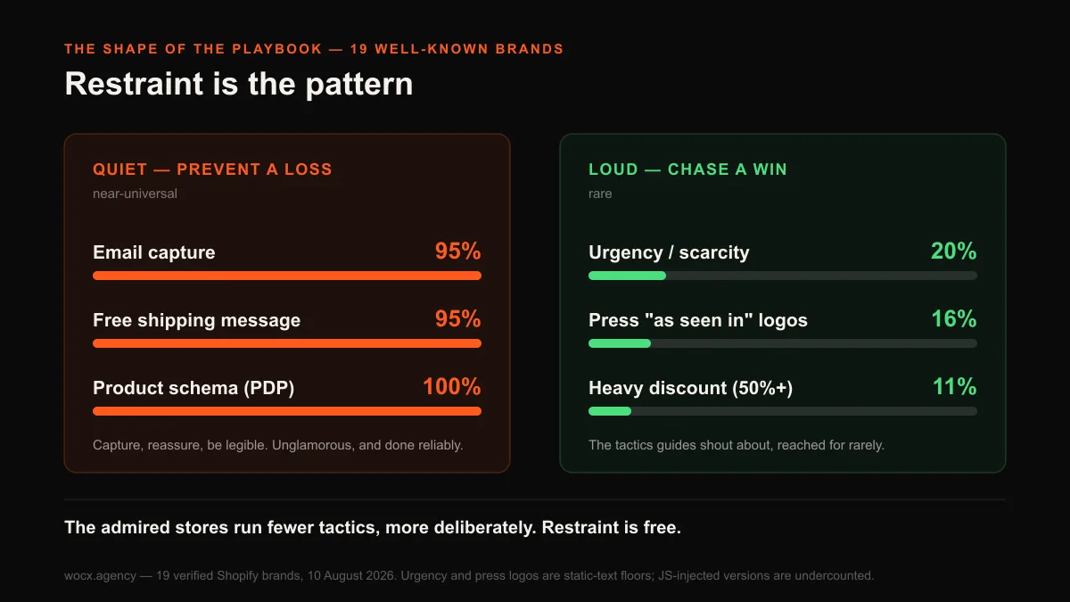
That restraint is the most transferable thing here, because it is free: it costs nothing to answer shipping honestly instead of inventing a countdown. The admired stores are not out-spending you on tactics. They are running fewer of them, more deliberately.
What to actually do with this
If you are working on your own store, the measured version of “learn from the best” is more useful, and more freeing, than another inspiration grid.
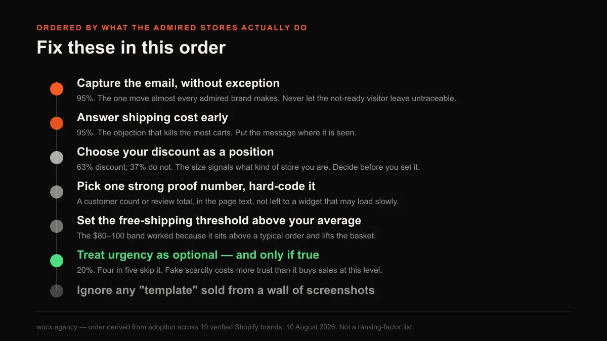
Capture the email, without exception. It is the one move almost every admired brand makes, and the one most likely to be treated as an afterthought.
Answer shipping cost early. If you offer free shipping over a threshold, set it in the $80 to $100 spirit of the data, comfortably above your typical order, so it lifts the basket instead of leaking margin.
Choose your discount as a position, not a reflex. More than a third of these brands lead with no discount at all, and the ones that do use the size to signal what kind of store they are.
Pick your single strongest proof number and hard-code it, the way Brooklinen and Thursday Boots do, so it shows instantly instead of waiting for a widget.
Treat urgency as optional, and use it only if it is true. Four in five of these brands skip it, because fake scarcity costs more trust than it buys at this level.
None of this is a template, and anyone selling you one from a wall of screenshots is guessing. What it is, is a measured account of how the stores people admire actually try to convert, which turns out to be calmer and far less dependent on the loud tactics than the guides that screenshot them let on.
FAQ
What conversion tactics do the best Shopify stores use?
Measured across 19 well-known brands, two are near-universal: email capture (95%) and a free shipping message (95%). A discount offer appeared on 63%, homepage reviews on 58%, and urgency messaging on only about 20%. The loud tactics like urgency are the least used; the quiet fundamentals are the ones almost everyone runs.
Should my Shopify store offer a discount to new visitors?
It is a positioning choice, not a rule. 63% of these brands lead with a discount, but the size ranged from 10% at premium brands like Gymshark to 50 to 70% at discount-led brands, and 37%, including Allbirds, Glossier and Kylie Cosmetics, offered no discount at all. The size of your entry discount signals what kind of store you are, so choose it deliberately.
Do the best Shopify stores use urgency and countdown timers?
Mostly no. Text-based urgency appeared on only about 20% of the product pages we measured. The figure is a floor, since timer widgets load via JavaScript we cannot fully see, but the direction is clear: four in five established brands do not write scarcity into the page, likely because fake urgency costs a maturing brand more trust than it earns.
What free shipping threshold should I set?
The brands that stated one clustered at $80 to $100. The logic is that a threshold works as an average-order-value lever only when it sits a comfortable step above your typical order, nudging the basket up. Set it at or below your current average and you pay for shipping without getting the lift.
How should I show social proof on my store?
Beyond installing a review app, which nearly everyone does, decide which single proof number is your strongest and write it into the page as text rather than trusting a widget. Brooklinen hard-codes “100,000 customers” and Thursday Boots “37,271 reviews,” so their most persuasive number shows instantly instead of waiting for a script.
Curious how your own store’s conversion choices compare to these 19? Send me your URL and I will measure the same things and tell you which fundamentals you are missing and which loud tactics you can stop worrying about. Free, and usually a reply within the hour.